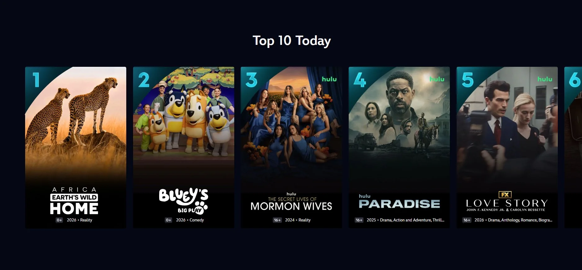
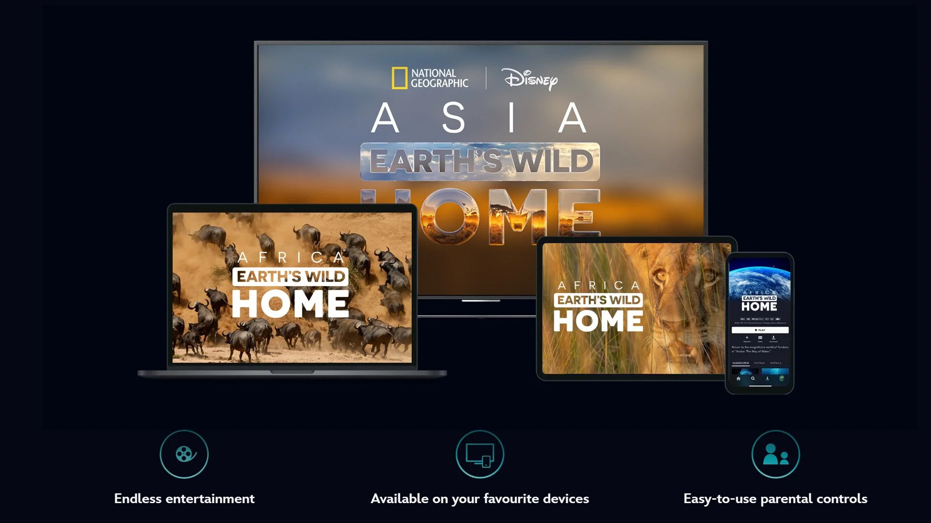
Earth’s Wild Home
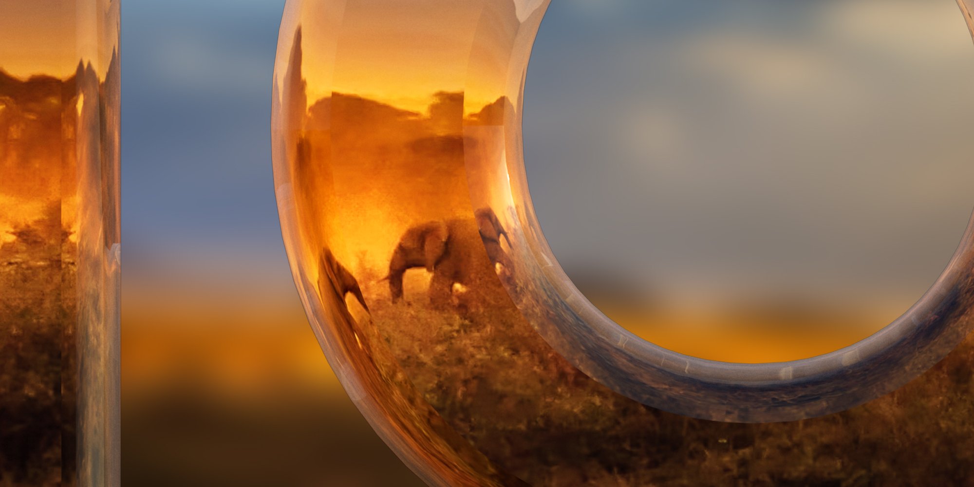
CONCEPT 3: MIRROR
The title text is Large and dominant, making it instantly readable. The 3D-styled render gives a sense of depth and scale.
The title text has a glossy, almost mirror-like surface, which deepens the thematic connection between the viewer, the title, and the planet while adding polish and dimensional richness.
The logo blends scientific credibility, emotional storytelling, and visual impact into a single, cohesive identity. This gives the brand an informative and epic feel.
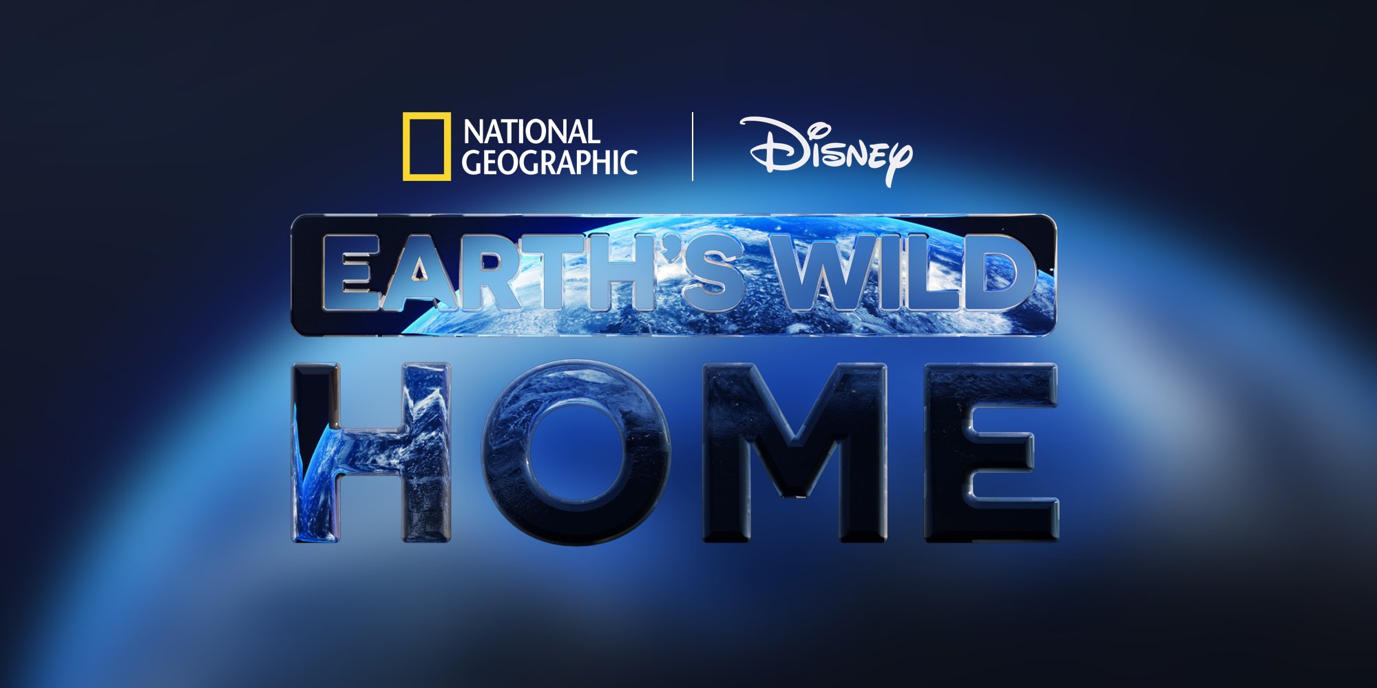
Key Features of Typography In Response To Brief:
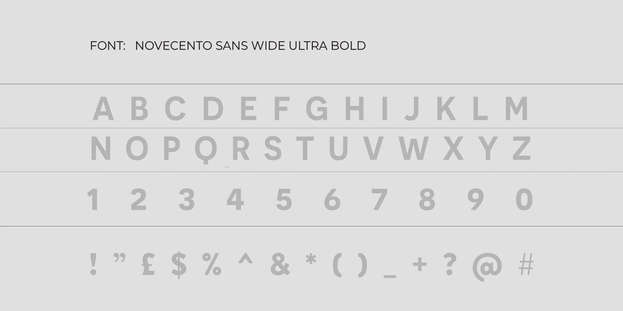
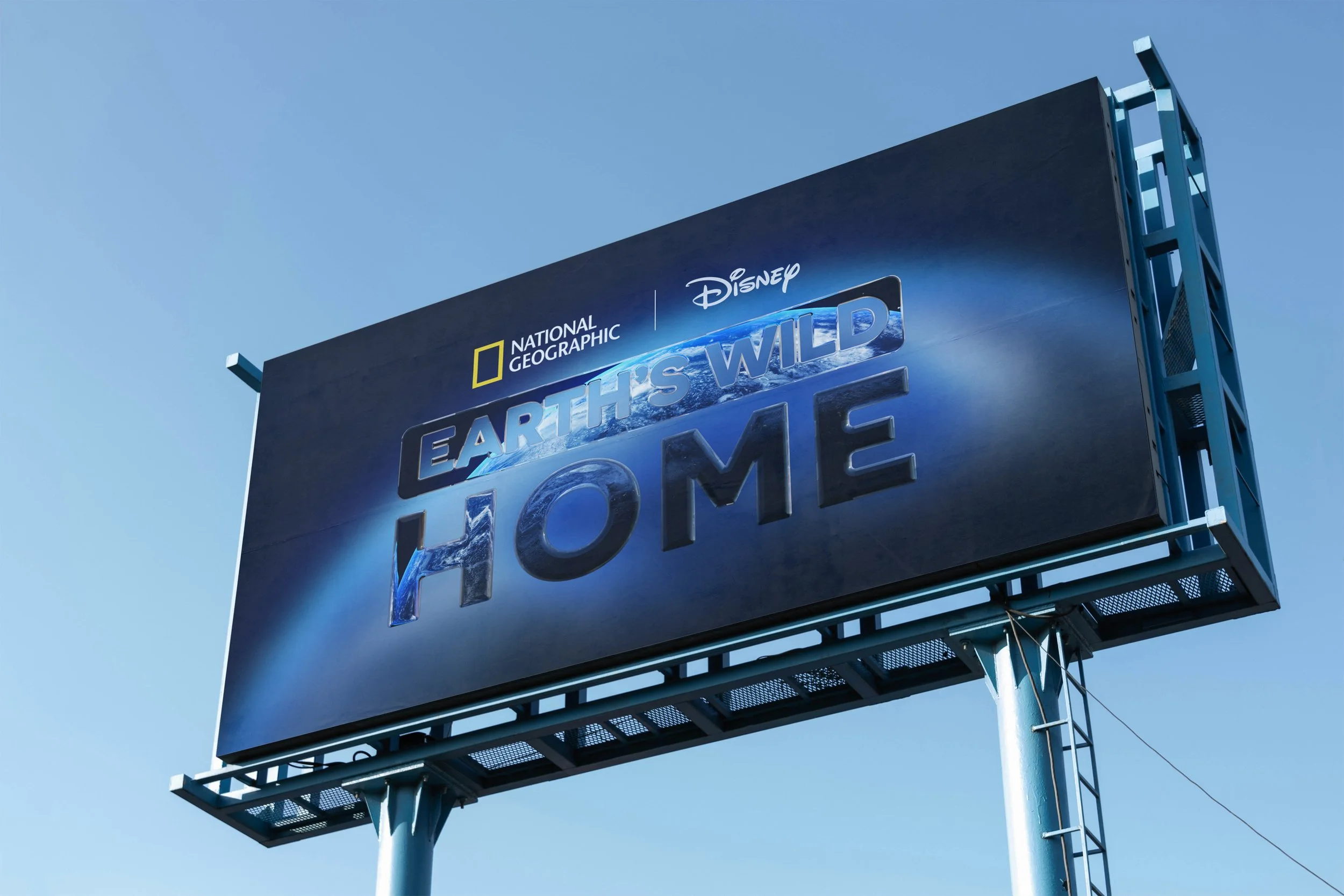
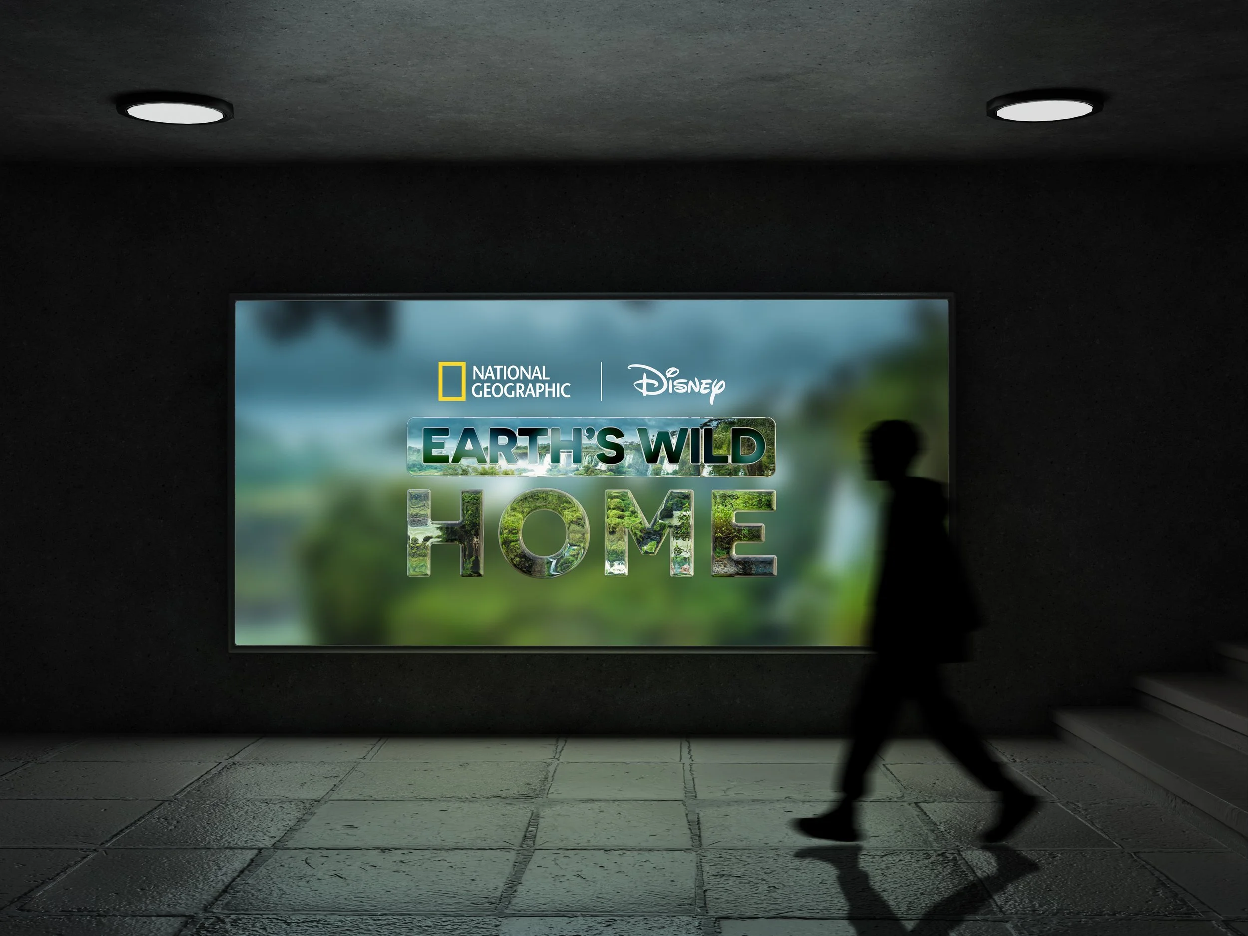
We will use Novecento, which is a clean, modern geometric sans-serif font. We will use rounded edges (especially visible in “O” and “E”) to give a friendly, approachable feel. No decorative elements will be used thus keeping the logo contemporary and versatile
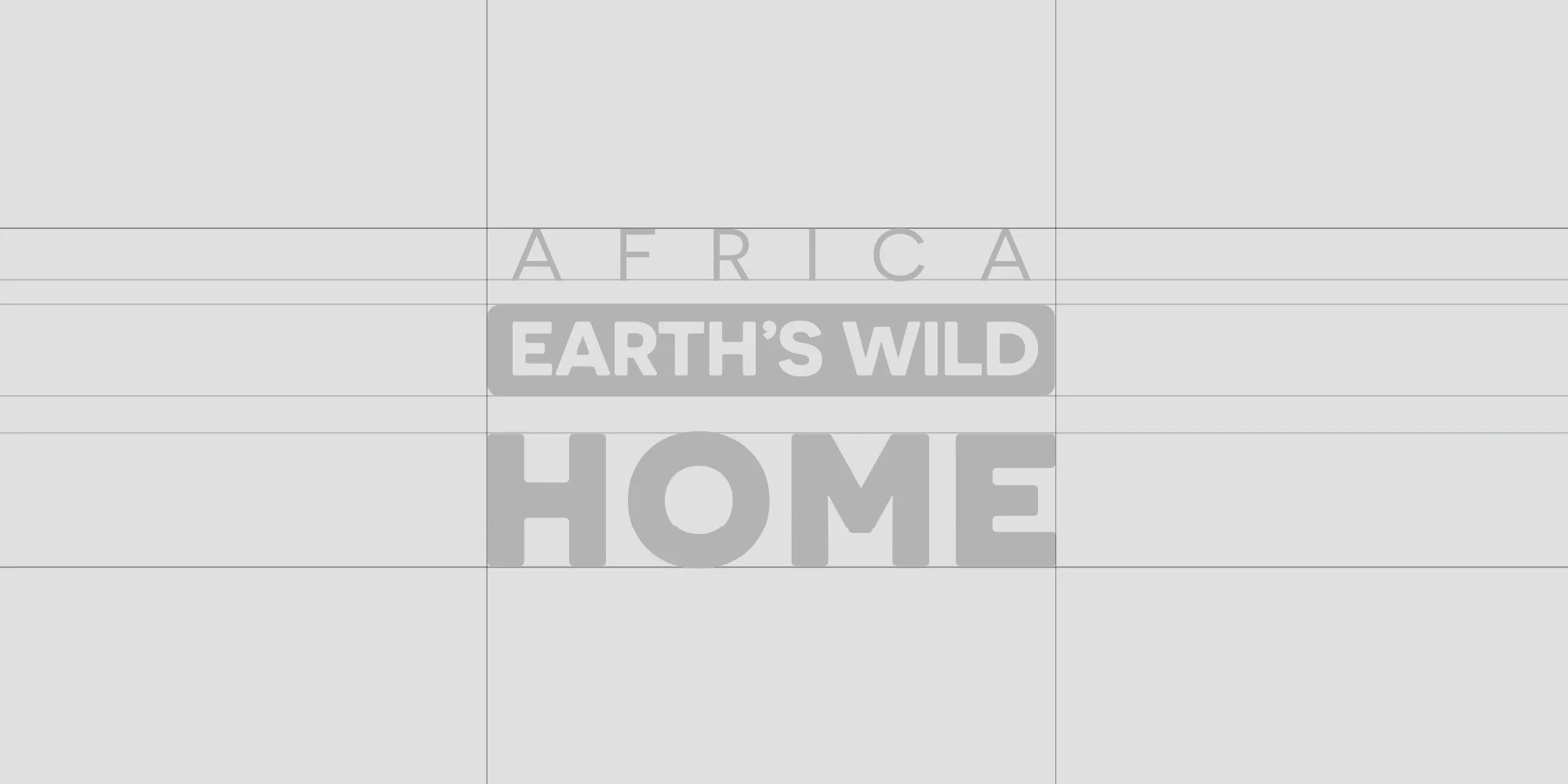
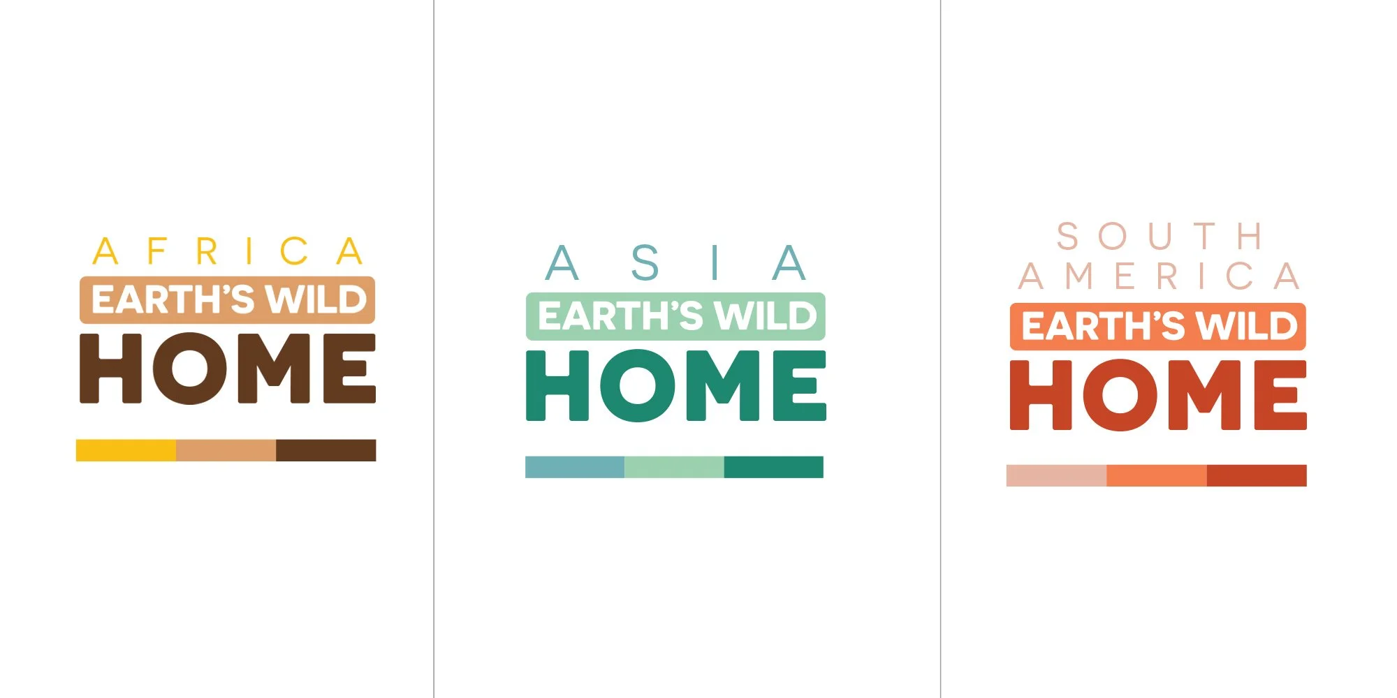
“EARTH’S WILD” will be placed inside a rounded rectangle (pill-shaped box). This acts as a visual bridge between the top and bottom text.
Weight anchoring “HOME” works like a visual base, making the logo block feel solid, safe, and foundational. The use of a single typeface lends a cinematic gravitas to the design and communicates credibility and documentary authority.