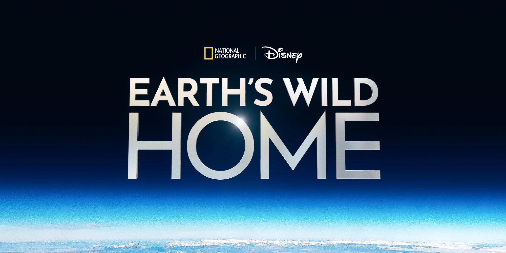
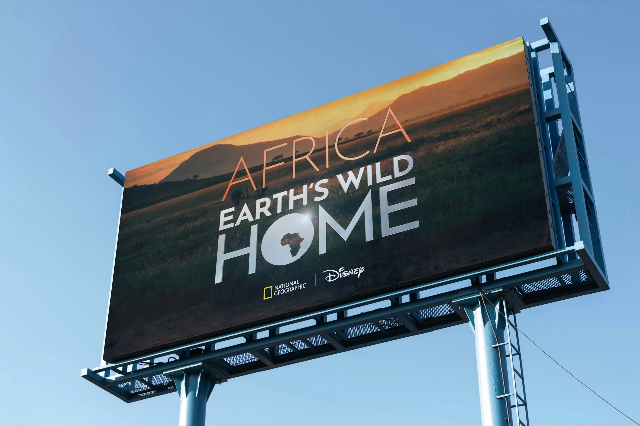
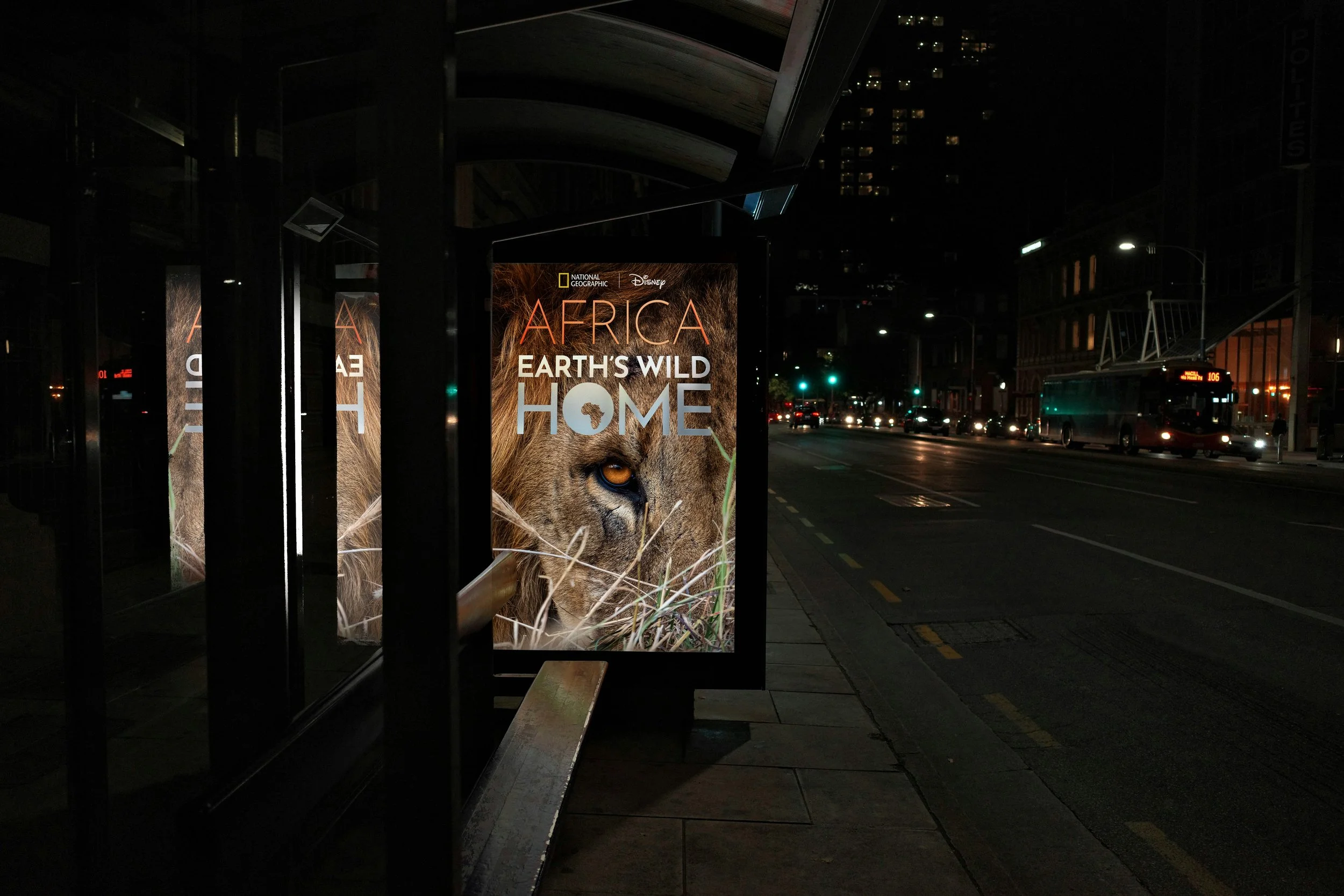
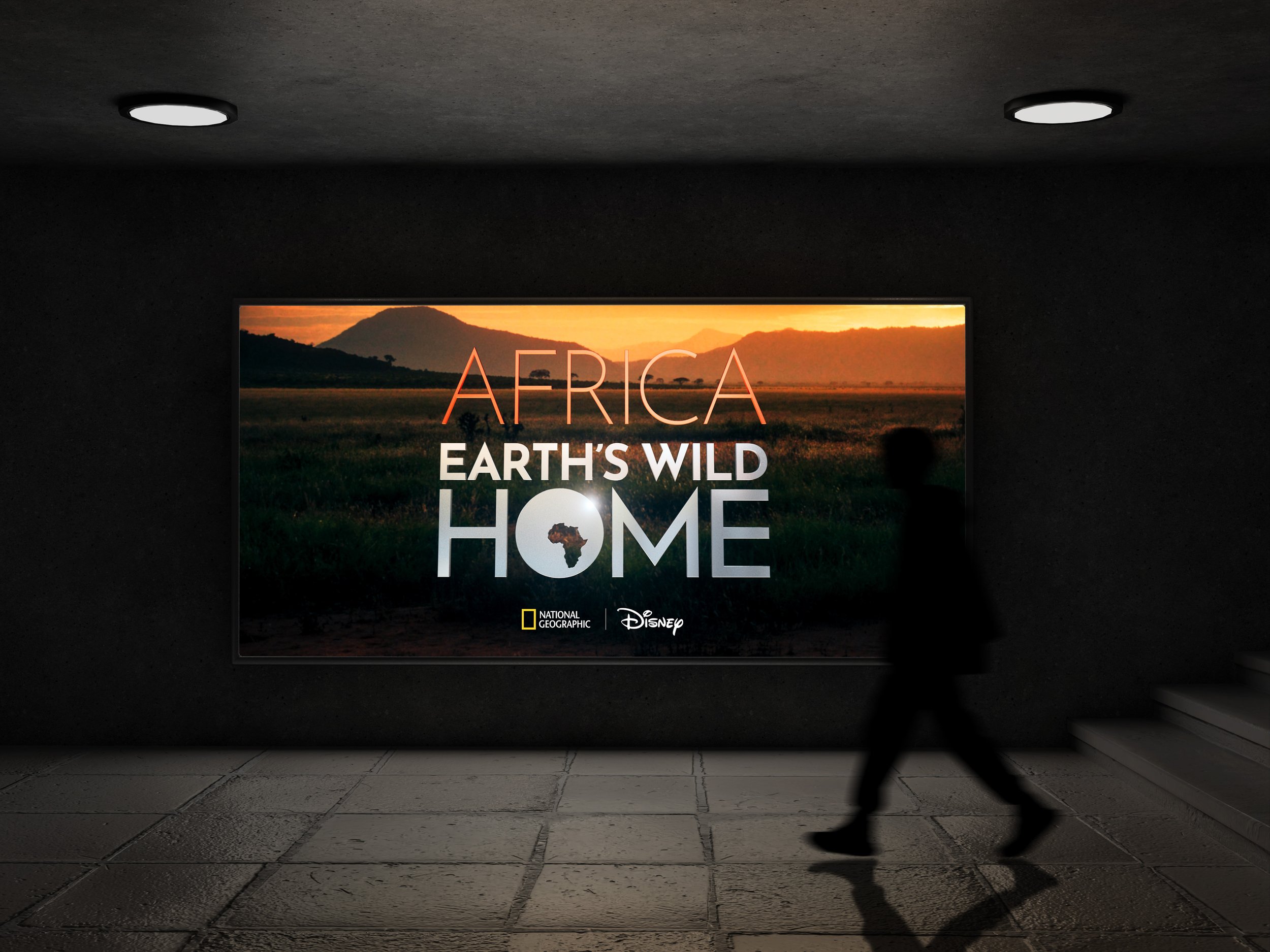
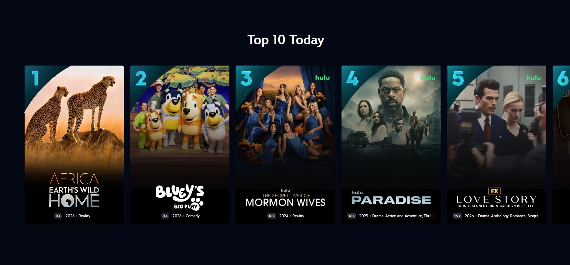
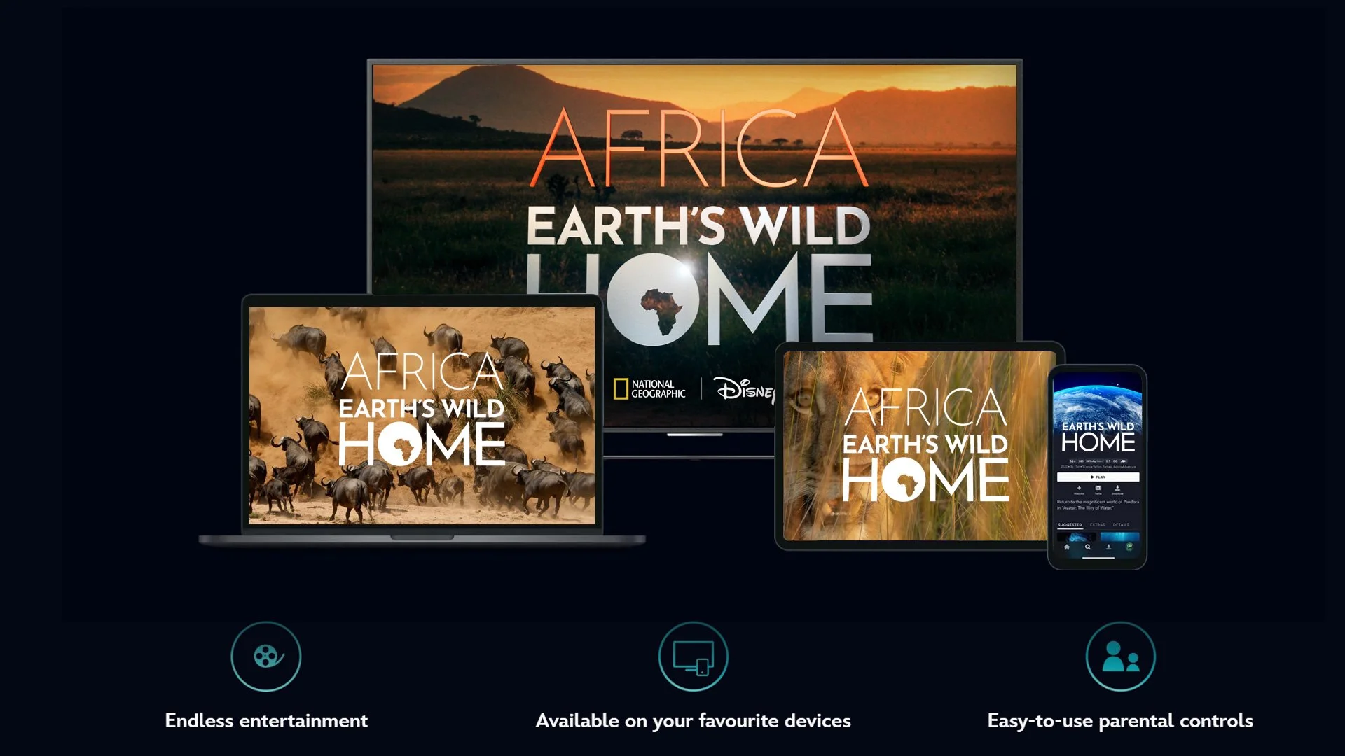
Earth’s Wild Home
CONCEPT 2: STENCIL
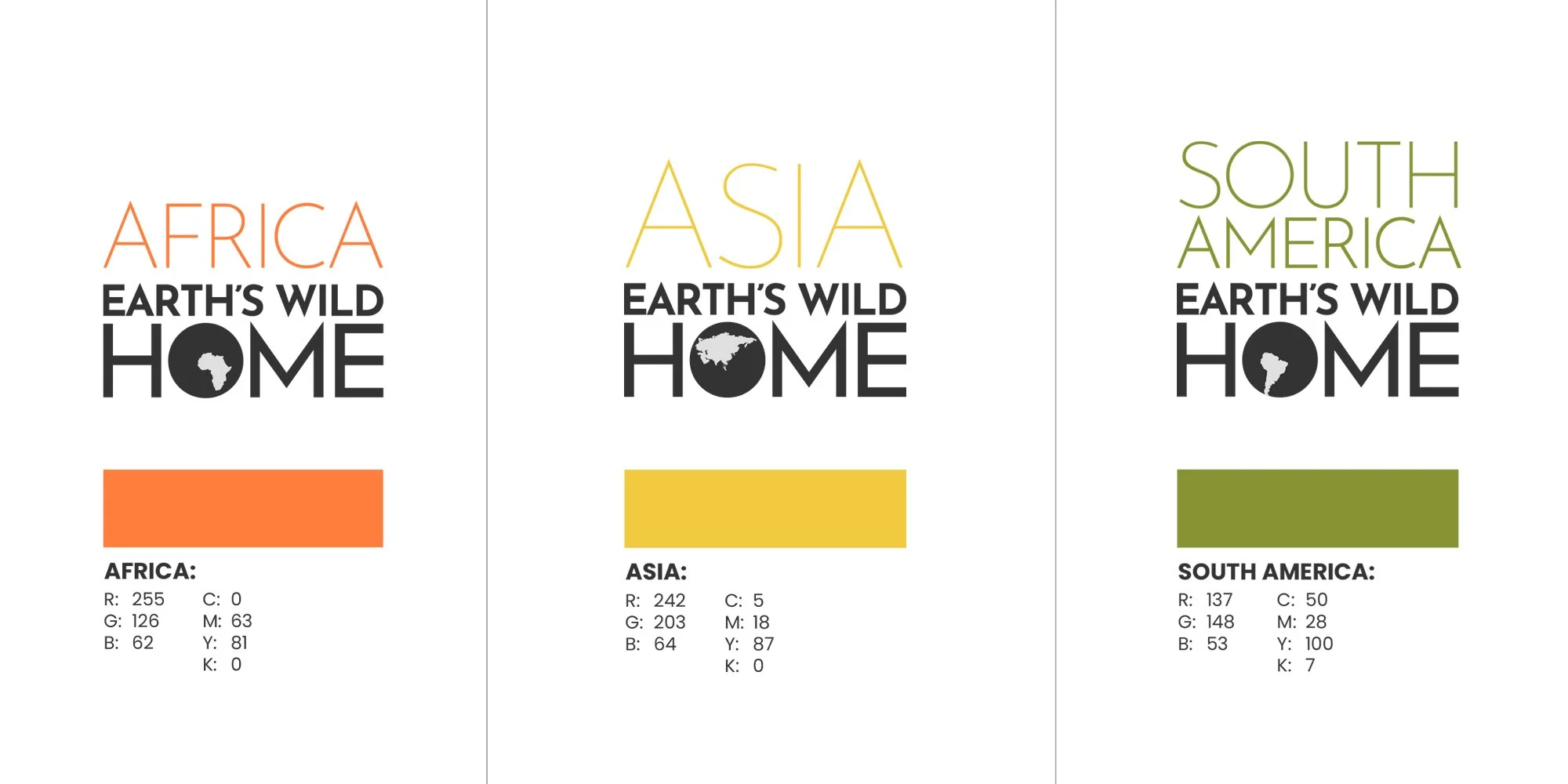
The aim of this route is to create a brand that feels both warm and inviting while also remaining epic and cinematic in presence. A graphic device sits within the ‘O’ of “home,” showing the relevant continent and its geographic position in the world. This treatment not only creates clear distinction between each series but also reads like a small window into the world that the show will explore, hinting at setting and scale.
Key Features of Typography In Response To Brief:
Using varied typographic weights to clearly convey the different facets of the brand values. A robust, bold weight for the main title to feel inviting, friendly and warm, paired with a lighter, more refined font for the series title to create an epic, cinematic contrast.